
Do you care what the back the postcard looks like? To me, I like to put a lot of extra care into the back to show the person receiving my card that I put thought and effort. I don't want to make it look rushed or unthoughtful.
I polled the unofficial Postcrossing group on Facebook to see how other Postcrossers feel about the back of the card. The results were surprising, a very large majority of Postcrossers agreed the back of the card is important.

Here are some tips on how to make the back of your postcards look like you went that extra mile:
#1: Write something! Many people struggle with what to write on the back of the postcard. It's hard to convey anything meaningful to somebody you don't know and with such limited space. Postcrossers seem to be split in half regarding how important the message is. Some people (like myself) are more interested in the postcard itself, not so much the message on the back. To others, the message is the most important part of the card. They enjoy learning about new people, cultures, and lifestyles. If you're unsure what to write, many people include ideas on their profile.
Some people like to help give the sender an idea of what to write in case they struggle. Here's an example from my profile, where I list ideas of what to write:

Here are some Postcrosser's opinions on messages:


I really love Hanna's idea explaining where you are writing the card from!
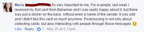
Some people are very specific about the back:

#2: Decorate! I love to see that someone put effort and care into the back of the postcard. Using different color inks to write, washi tape, and stickers. I even include on my profile that if you don't want to write something you can simply decorate with stickers!
Here are some examples from my collection where the sender added some decorations:

United States: From MangoMeliss (Postcrossing Forum)

Chile: From @Mayerly_Post on Instagram

Taiwan: From Chi (Postcrossing Forum)
#3: Use Nice Stamps! Using nice stamps is also a bonus, however, it's not fair to expect everyone to purchase special ones. Here in the US, Postcard Stamps are about 15 cents cheaper than Forever Stamps which add up in the long run. I get bored of seeing them, but I can't blame people for using them, either. A cheap hack for this can be to purchase OLD stamps valued at the same price as new Postcard Stamps.
Here is an example of some of the nice stamps I've received on postcards:


#4: Write Neatly! Not everybody has great handwriting and it can be especially hard for people who use different writing systems than what we use in English. However, just do your best, try not to write too sloppy.
#5: Coordinate! This one may be a bit tougher depending on what supplies you have on hand. I try to stick with an overall color theme. For example, if the front of my postcard has lots of blues, on the back I'll try to carry over the blue theme. By using blue pens, washi, stickers, and even stamp if possible. It just looks nicer. However, it's not always possible. Another idea I like to do is bring the theme of the front to the back. For example, if I sent a postcard with a cat, I like to try to decorate the back with cat stickers and write about my cat. Again, this is tougher if you don't have a large supply or budget, but it's always worth a try if you can!
I feel this Postcrosser 'mindahas' in the All About Women Round Robin, on the Postcrossing Forum nicely coordinated the colors of the front and back of the card.


Warm Wishes,
Amanda
No comments:
Post a Comment